exponential
BRAND IDENTITY AND WEBSITE DESIGN.
2019
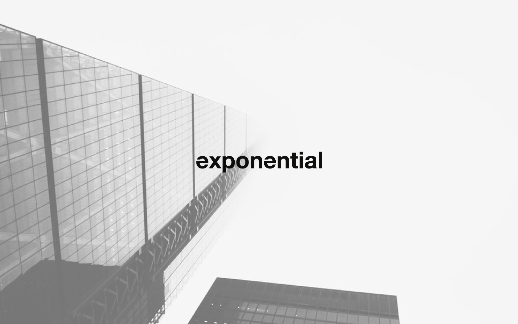
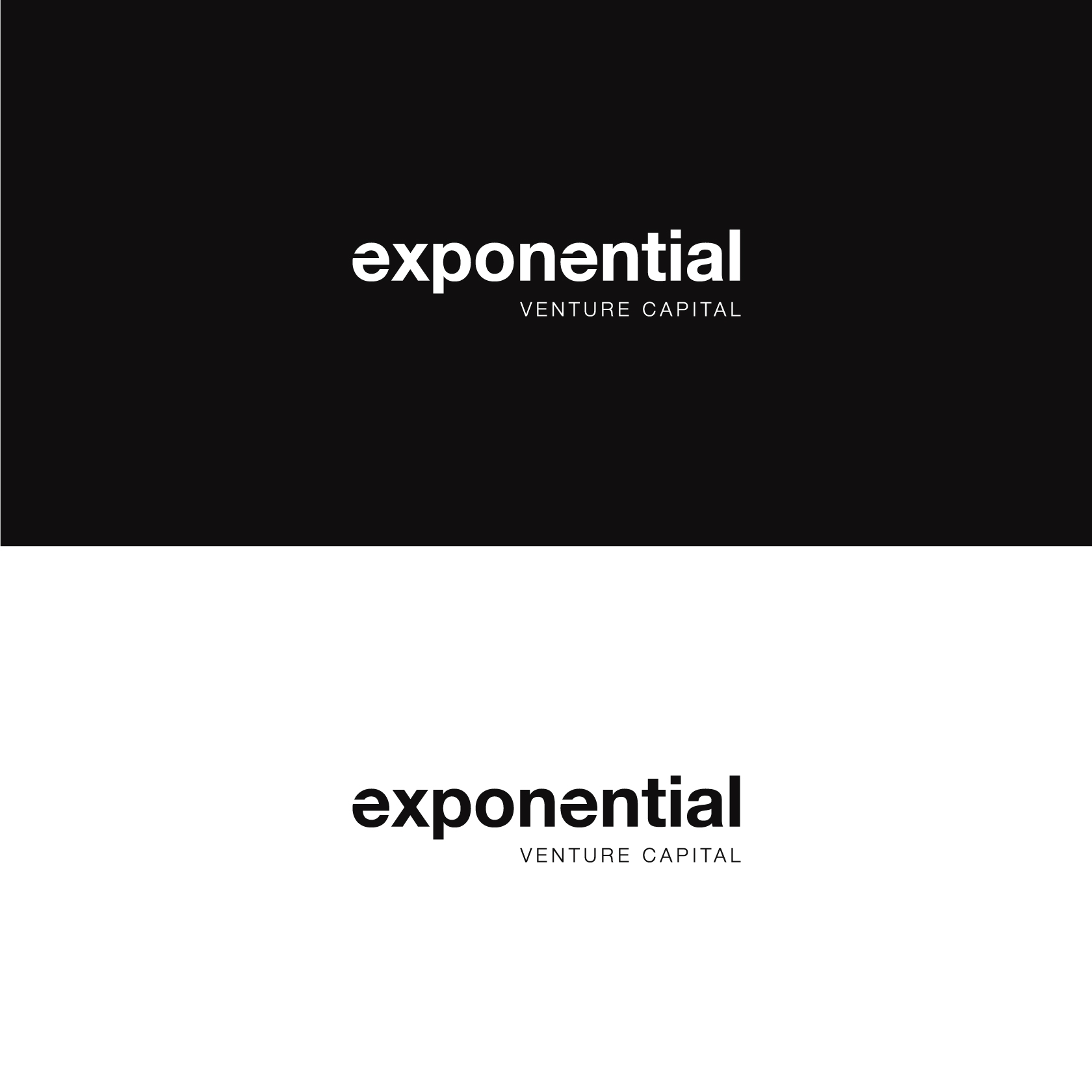
The brand and logo is simplistic yet bold, the focus was to keep the brand identity minimal yet effective.
The use of lower case letters is symbolic and saying the brand is professional yet has a lighter more playful side to the brand while maintaining the core values of trust, integrity and consistency.
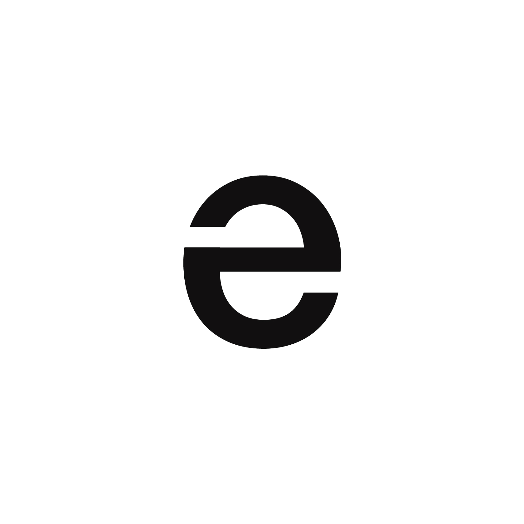
The Letter e has been designed so it mirrors and if you rotate the e it will look the same from top or bottom.
This is representing the consistency of the brand and no matter how you look at or approach exponential, they will always maintain their values and be consistent within their business practices.
A very simple yet strong colour pallet was used for exponential's images and branding materials, black and white was the main focus and this carries throughout the brand identity.
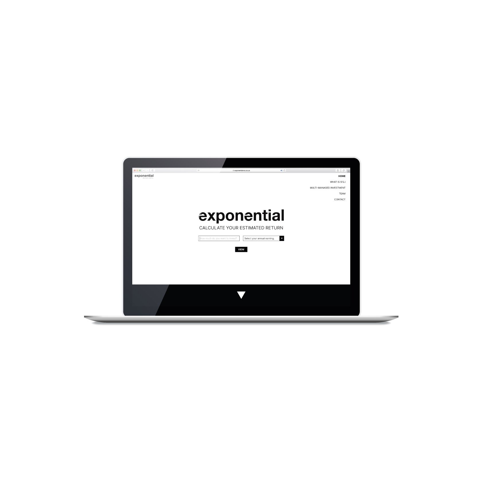
We worked with our partners Billow to build a calculator functionality for the client, where the site would allow and provide the viewer with a calculation on their estimated money returns on investing with exponential.
The viewer would have an estimated graph print out where they would be able to view their Targeted Investment Cash Flow.